
As a business owner, you don’t need to be a designer—but you do need to understand the basics of logo design.
Why?
Because when you’re working with a designer, the more informed and specific your feedback, the better the end result.
Also, wouldn’t you prefer to impress your design-y colleagues when you use the proper terms to describe the elements of your brand?
A well-crafted logo isn’t just a pretty mark; it’s a crucial tool for building your brand, ensuring consistency, and making an impact. And yes, you need different versions of it for different use cases.
So, before you approve your next logo project, make sure you have these essential logo variations in your branding toolkit:
The 5 Versions of Your Logo that Every Brand Should Have
1. The Icon
Your logo’s icon (or symbol) is a standalone element that represents your brand in a simple, memorable way. Think of Apple’s apple or Nike’s swoosh. It should be clear and recognizable, even at small sizes, and work across different mediums, from social media avatars to mobile app icons.
2. The logotype
Your company’s name (aka wordmark or logotype) should also be considered as its own mark or element that could be used as a stand-alone, but you’ll have a more versatile brand if your brand has both an icon and wordmark.
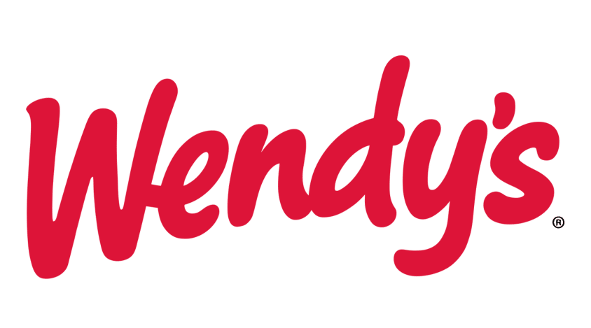
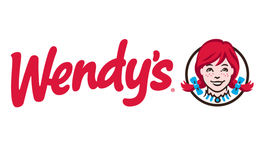
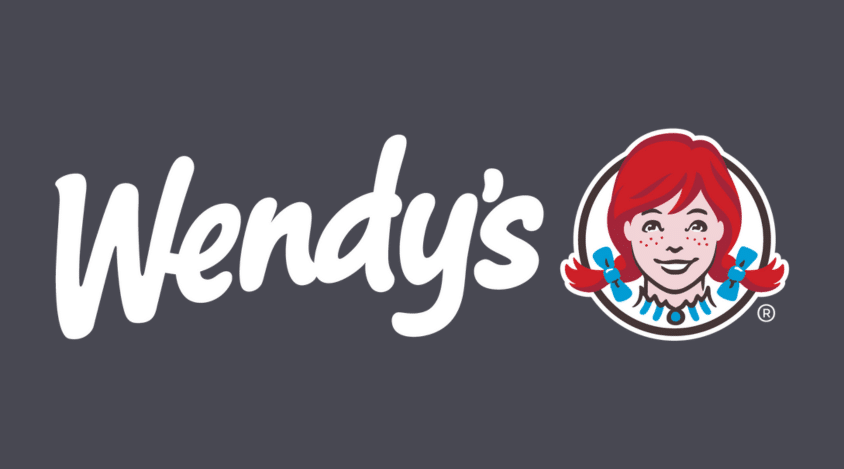
3. The Horizontal Logo
Together, your icon and company name makes up your full logo also known as logotype to professional designers. The horizontal version includes both the brand name and the icon arranged in a horizontal layout.
It’s one of the most commonly used logo formats because it fits well in website headers, business cards, and signage. If you only have space for one logo format, this is often the most versatile choice.
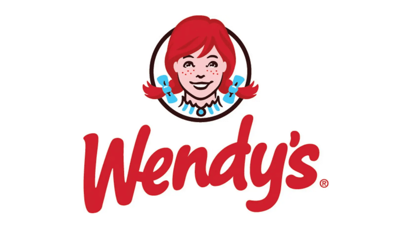
4. The Stacked Logo
A stacked logo arranges the text and icon in a vertical or centered format. This version is useful when a more compact or square-shaped logo is needed—like on social media profiles, packaging, or promotional materials where space is limited.
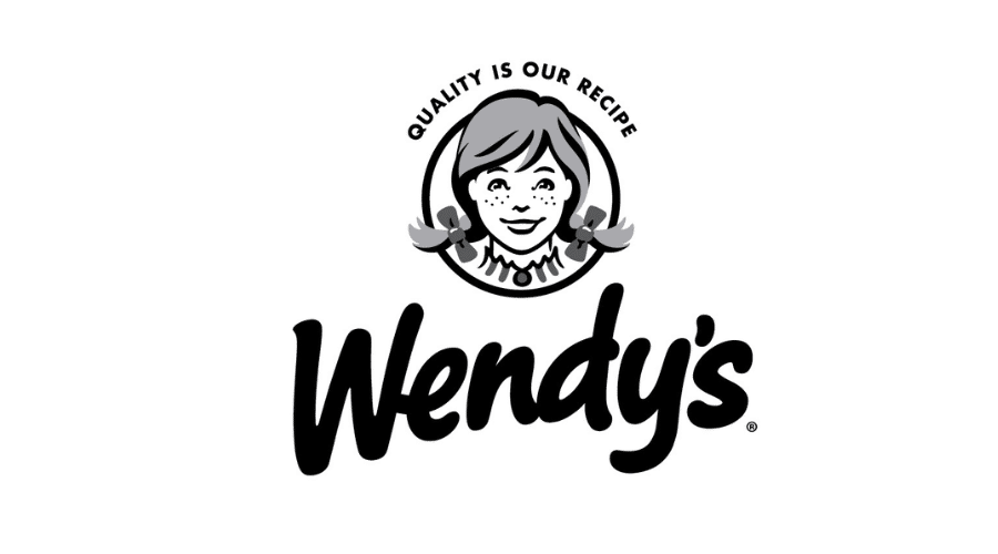
5. The Black and White Version
Color is important, but your logo must work in black and white, too. This version ensures that your logo remains effective in scenarios where color printing isn’t available or practical, such as newspaper ads, faxed documents, or engraving. If your logo doesn’t hold up in black and white, it’s time for a redesign.
6. Bonus: The Knockout Version
Sometimes called a “knockout” logo, an all-white version is essential for placing your logo over dark backgrounds or images. It’s especially useful for social media, video overlays, and merchandise like T-shirts or signage. Without this version, your logo might become unreadable in certain applications.
Final Thoughts
Great branding starts with a great logo, but a single version won’t cut it.
Having these essential variations ensures that your logo looks professional, adaptable, and ready for any situation.
When working with a designer, be sure to request these formats—it’s a small step that makes a big difference in maintaining a strong and consistent brand identity.
And of course it helps if your logo is a true reflection for your brand. For more tips for creating a logo you’re really proud of, download our Ultimate Guide to Logo Design.

0 Comments